Wednesday, 29 July 2020

Project - Research about artwork

This project will take five weeks to complete, and it is a design project that uses the following an artwork as a starting point.

Ideas Inspired by The Swimming Hole


Artwork


Thomas Eakins The Swimming Hole (1884-5) Oil On Canvas

- What first impressions do I have?
When I first saw this work, I could see realistic natural depictions, colors, and people. Among them, the first thing that stood out was people's poses. Several people were depicted in the work, each posing differently. I found this point most interesting in his artwork.

- What does it make I think of?
- What connection can I find with the image?
There are seven characters in his artwork. Some people pose to match the background, swimming hole, but others do not.

- How could this be a starting point to my own work?
I try to express it in digital graphics with the pose of the character, which is the most noticeable point in the work. Try to think about whether human posture how can be expressed in digital design.

Research

I did research on the artwork and Thomas Eakins before developing the idea of this project further.


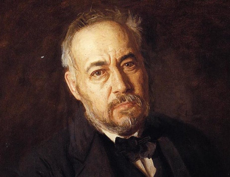
According to The Metropolitan Museum of art website, Thomas Eakins dedicated his career to depicting the human figure—in oil and watercolor, sculpture and photography. His 'The Swimming Hole'  also illustrates the special features of his work. 

In his work 'The swimming Hole', which was encountered by the project, a total of seven characters posed out of place, or posed in harmony with the background. In addition, I could see from other artworks that he enjoyed realistic portrayal of human poses.


The above work is another work by Thomas Eakins, 'Taking the count'. In the painting, he also set the three main characters' poses as the main focus. 

Although he excelled in the shape of his work of the character, there was controversy in the course of his other character works. According to LUBOCK.T (2008), who believes in his life model, said he lost his teaching job after allowing mixed-race students to become nude men. He was the center of controversy over the character's pose. However It is thought that it is an indispensable factor in his work that is important. This is why I chose the pose of the character as my project


References

Lubbock T. (2008) The independent Great Art Series: The Swimming Hole by Thomas Eakins [Online] Available from: https://www.independent.co.uk/arts-entertainment/art/great-works/eakins-thomas-the-swimming-hole-1885-776575.html (Accessed 27/07/20)

The Metropolitan Museum of Art (2004)Thomas Eakins (1844-1916): Painting [Online] Available from: https://www.metmuseum.org/toah/hd/eapa/hd_eapa.htm (Accessed 27/07/20)


Wednesday, 22 July 2020

Final - Book as Inspiration

Book - Life of Pi

Project: Book as Inspiration
------------------------------------------------------

Size: A3 (Sketchbook)
Material:  watercolours, coloured pencils, pens
------------------------------------------------------

Final work


This book is a novel written by Yann Martel. This is one of the novels I read interestingly. The novel is about how the main character survived the animals and lifeboats. In the ending, when the main character talked about his survival, he said that it was true that humans, not animals, fought and killed each other to survive.

I tried to express in this work that it was not clear whether it was humans or animals who made unrealistic journeys with the main character, Pi.

Because of this, the main characters were expressed in shadows. The figures of the shadows were represented by the animals as zebras, orangutans, hyenas and tigers, but in fact wanted to show that these might not be animals.

Tuesday, 21 July 2020

Book as Inspiration

Book - Life of Pi


This book is a novel written by Yann Martel. It is a novel about the survival of the main character Pi. The story begins when an accident occurs while emigrating to Canada with a father and family who own a zoo.

I actually saw this book as a film at first. When I first saw this story, I thought a lot when I heard the story of Pi at the end. At the end, Pi expressed his survival journey with two stories. The first talked about zebras, hyenas, orangutans, survival with tigers, and the second with humans. Of course, the novel did not directly state what was true.


I think the strength of this book is its creative portrayal. Designers are sometimes a job that makes and describes things. Moreover, after reading this novel, I had a lot of lingering thoughts about the main character's survival and journey. And I hope this feeling will appear in my work.


Process


Size: A3 (Sketchbook)
Material:  watercolours, coloured pencils, pens
-----------------------------------------------------------


Watercolours were used as main materials and lines were drew with colored pencils after watercolour work for detailed work.

Firstly, I drew the main characters of the novel, animals, and PI.


References

MARTEL.Y (2016) Life of Pi.  Edinburgh: Canongate

Wednesday, 15 July 2020

Final - warrior

Final


Cleopatra Book Cover
------------------------------------------------------
Book Size: 128*198 mm
Software:  Procreate (For idea sketch), Photoshop and Illustration
Main Colour:  Yellow (#fbcc1e), Purple (#844ab8)
------------------------------------------------------

In this project I chose Cleopatra from among some of the warriors.

She, who I have studied through research, always values her country first and always shows her strength to protect it. Through this study, I learned what kind of character Cleopatra has and What relationship with two of Roman soldier, Caesar and Antonius. In addition, I got the idea of how to express it in my project. First of all, I thought Cleopatra's strength and charm could be well expressed on her face. 

It is said that most people can tell their personalities by the facial expressions on their faces. When studying her, most of her works and paintings expressed her toughness in her eyes. I wanted to show her that way in my work.

It is said that most people can tell their personalities by the facial expressions on their faces. When studying her, most of her works and paintings expressed her toughness in her eyes. I wanted to show her that way in my work.

I am sorry that I did not consider the time especially for this work among SMART. So I feel that my work lacks research and progress.


Thursday, 9 July 2020

Ideas & Processes - warrior


Ideas

I'm trying to show her enchantment and toughness with book cover designs

Cleopatra is Egypt's last queen. Her desire to protect her country and her relationship with Caesar and Antonius showed how enchanting and strong she was.


Processes

Book Size: 128*198 mm
Software:  Procreate, Photoshop and Illustration

1. Sketch ideas using Cleopatra's Images from this previous research post
2. Taking sketches into shape in Photoshop and Illustration Programs
3. typography : Research on a style harmonized with book titles and illustrations.
4. Selecting colors


1.


To sketch ideas, I used a program called Procreate. I think it could be a digital sketchbook. It is difficult to do detailed work like illustrations and Photoshop, but it is convenient to draw and erase sketches. It was also good to consider colors together when I was sketching the beginning idea.

First, I choose a picture similar to Cleopatra's image that I wanted to express and proceeded with the idea sketch. I tried to figure out what color combination would be like in advance.


2.

Secondly, I thought about the font of the letter that will be the title of the book cover. To do so, I first studied serif and sans serif.


According to IMPACT(2019), the serif font is more ornamental and has serifs extending from the ends while the sans serif font on the left has clean and very precise ends.
In addition,  the most notable characteristic of serif fonts is their decorative tails and strokes.

For Cleopatra, the serif typeface is more suited than the sans serif typeface, as can be seen only by looking at these two main features.


 I thought serif typeface was more appropriate than sans serif typeface to express her strong and attractive character. So the title font used 'Times New Roman'.


I chose purple as the main colour to express Cleopatra, a seductive and mysterious image. However, I'm thinking about it more because it doesn't seem to express as well as I thought. I should think more about colours before the final board.


IMPACT (2019) Sans Serif vs Serif Font: Which Should You Use & When? [online] Available from: https://www.impactbnd.com/blog/sans-serif-vs-serif-font-which-should-you-use-when#:~:text=A%20serif%20is%20a%20decorative,hence%20the%20%E2%80%9Csans%E2%80%9D). (Accessed 13/07/2020) 


Wednesday, 8 July 2020

Research - warrior


Project - warrior : Cleopatra

In this project I'm going to work on Cleopatra. Cleopatra had shown a brave face, trying to protect her royal family and Egypt from Rome.

Pharaoh Cleopatra VII was a brilliant leader, says Joann Fletcher. "She was one of the most dynamic figures the world has ever seen. And I don't think that's an exaggeration." (Smithsonian Magazine, 2007)

The reason I chose her is that she is a very attractive person as well as her qualities as a warrior. I could see more clearly from the research that she was an attractive warrior.

Research


Through this study, we learned what kind of character Cleopatra has. In addition, I got the idea of how to express it in my project. First of all, I thought Cleopatra's strength and charm could be well expressed on her face. Most studies show her on face and Egyptian jewels.

I'm going to design a book cover with her eyes. Usually, I think I can tell a person's personality by looking at his or her eyes. I want to express Cleopatra's tough character and identity through her eyes.

The next post will take this idea and work in more detail.


References

Duane. W (2011) Cleopatra : A Biography.  Oxford University Press USA - OSO

Smithsonian Magazine (2007) Who was Cleopatra? [online] Available from: https://www.smithsonianmag.com/history/who-was-cleopatra-151356013/ (Accessed 06/07/2020)


Thursday, 2 July 2020

Welcome to Summer Term (Pre-Master) 2020

Welcome to the new term. As a student who is going to major in Digital Design MA in DMU, I am going to show my digital design work through blog this summer term in DMUIC.


I am going to introduce one person who inspires my work. His name is Bong Joon Ho and he is a film director. Although he does not work with work in the same field as me, I like the films of the scenario he worked on.

The first time I saw his film was when I was primary student. The name of the film is 'The Host'. At that time, I did not know much about him because I was young, but I am remembering the film because it was unique and new to me. 


 Bong Joon Ho (Born 14th September 1969)  
Source : oscars website

I am going to introduce one person who inspires my work. His name is Bong Joon Ho and he is a film director. Although he does not work with work in the same field as me, I like the films of the scenario he worked on.


You can see some of his work here. I have seen 5 of these. If you have seen some of these, you will see the characteristics of his work. I think he mostly talks about the normal background of everyday life in the film. But I think he has a unique and eye-catching power to tell his stories. This is why I like his work and his work has a positive effect on me.


Thursday, 28 May 2020

Finalise & Reflect

Reflect

Through this term, I was able to access various parts of digital design. Through several projects, I have made a plan, realized the plan myself and produced the final board. Although, sometimes it was hard because it was different from the original plan.


Through the first project, I learned the importance of brand identity and target. What is more important than the external beauty of the product is to consider the tendency of the target. In the process of making this final board, I researched various package designs, and the process helped me finish this work.


Through the second project, I realized the importance of the plan. In this work, I felt directly that systematic planning helped to make the work easier. I think the reason why this project was not successful, even though it was completed, was because it was not well kept of project plan. As a result, the idea of the first project was good, but it didn't work out well in the end.


Finally, Web site production was the most difficult but meaningful project of this term. The website production was made through a site called WIX, which I was the first time to use it. I did not have much experience making websites.  Indeed, I was clumsy at first. However, there were many factors on the WIX site that helped make it easier to build a website. Nevertheless, in order to be shown on the website in the configuration that I want, I have repeatedly modified and checked.

Website - Mobile View and adjustments

Mobile View

These days, more and more people  use many websites easily . For example, they access websites through their phones or tablets. Therefore, it is also important to consider users accessing the website on a mobile basis.

I checked the mobile version when the website was made to some extent. The WIX website automatically produces a mobile version similar to the PC version. This point is very useful and brings some problems at the same time.

.


First, I changed the location of the mobile version of the text box. In the PC version, the text is properly placed on the background image, but not in the mobile version.


Second, I changed the size of some images of mobile versions. Since the mobile has a smaller screen than the PC , sometimes the screen composition was not convenient due to the size of the big picture.

As I learned from the previous study, UI and UX research, I tried to produce two versions.


Tuesday, 26 May 2020

Website - Feed back (google form)

Feedback

Link (google form) : https://forms.gle/6XVAhTPjqajmPUMn9

Through the previous UI UX Research, I learned that the response to a user's website was important. I added a feedback menu to listen to the opinions of the users who accessed the homepage.I have created a feedback form on Google Forms. 


Questions

1. How did you like the look of the hom page?
- Poor
- Okay
- Good
- Excellent
2. Can you easily go to another page??
- Poor
- Okay
- Good
- Excellent
3. How is this website like as a portfolio?
- Poor
- Okay
- Good
- Excellent
4. What do you think of the Contact page?
- Poor
- Okay
- Good
- Excellent
5. What do you think of the About page?
- Poor
- Okay
- Good
- Excellent
6. Do the buttons on the website respond correctly?
- Poor
- Okay
- Good
- Excellent
7. Please let me know if there is anything else you want on the website. 
- (Short answer text...)


Feedback


Google Form was one of the forms that made it easy to ask users' opinions and responses. I was also able to check my website in the process of producing these questions. I tried to develop the website further with feedback from users.


Website - UI UX Research

UI & UX

UI - User Interface Design

 ‘transference of a product’s development, research, content and layout into an attractive, guiding and responsive experience for users.’ (Careerfoundry: 2018).  


- Visual Design
- Colours
- Graphic Designer
- Layouts
- Typography

According to LEEN. K (2019), user interface design is a broad design term. It may be about shapes and displays that allow users to interact on websites. For example, the above can be explained by the UI functions.


UX - User Experience Design

‘User experience design (UXD or UED) is the process of enhancing customer satisfaction and loyalty by improving the usability, ease of use, and pleasure provided in the interaction between the customer and the product.’ (Careerfoundry: 2018) 

- Interaction Design
- Wireframes and prototypes
- Information architect
- User research
- Scenarios

I studied in my class and researched about UI and UX for making my own website. I learned from this study that it is more important to make a website considering UI and UX than beauty. Before this research, I thought high-quality websites were well decorated. However, I learned from this research that UI and UX are needed in harmony to improve a website completeness.


Why Usability Test?

- uncover problems in the design
- Discover opportunities to improve the design
- Learn about users behavior and preferences

Before the usability test, my website had some problems. First, there were many buttons on the home page that users did not use. Indeed, it seems that the page movement was not natural. Second, I need to design a mobile version of the website with more consideration. It is true that many people nowadays search websites through their mobile phones. Through this research, I realized that when I work, I have to consider the mobile version. Although not yet perfect, I was able to work more delicately through usability test and above the research.


----------------------------------
References

Careerfoundry (2018) The Difference Between UI and UX Design - A Layman’s Guide [Online] Available from: https://careerfoundry.com/en/blog/ux-design/the-difference-between-ux-and-ui-design-a-laymans-guide/ (Accessed 24.05.20)
LEEN. K (2019) The Psychology of UI and UX [Online] Available from: https://medium.com/media-reflections-past-present-future/the-psychology-of-ui-and-ux-ca34c674fb88(Accessed 24.05.20)